


I wasn’t a fan of UI libraries until I started using Shadcn UI. It has gathered a lot of attention over the past few months, but how stress-free it is making frontend developers experience. It is so flexible and offers a number of different types of beautiful components; now I don't need to bother myself with hand-coding some components like dialog, select, dropdown, tabs, and the like. Shadcn/ui truly has made life easier for developers.
Like every other new technology, working through some aspects can be tricky, which is normal, which is why I want to break down how to work with a specific shadcn/ui component, which is the dialog.
Dialog can be defined as a window overlaid on either the primary window or another dialog window, rendering the content underneath inert. This definition is from Shadcn/ui Docs. Dialog can be basically seen as a MODAL component.
So let us now go to the practical aspect of it:
For this article, we are going to use Nextjs and Shadcn/ui.
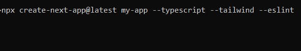
Firstly, we are going to install Nextjs v14 and TailwindCss. It is worth noting that shadcn/ui components are built upon TailwindCss. Run the command below:
Run the command: npx create-next-app@latest my-app — typescript — tailwind — eslint
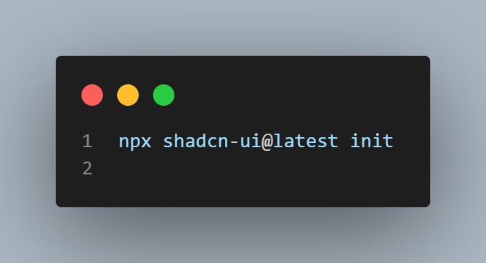
Then, after installing Nextjs, we are going to go through the installation of the shadcn/ui library in our application.
Run the command: npx shadcn-ui@latest init
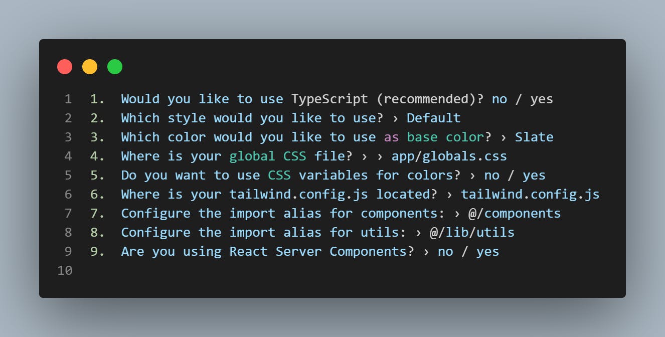
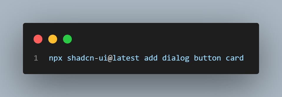
After executing the above, we are going to install the shadcn/ui components we will need for this particular lesson. I will be using dialog, button and card components.
Run the following command to install them: npx shadcn-ui@latest add dialog button card
Now is time to create our Dialog Component file,
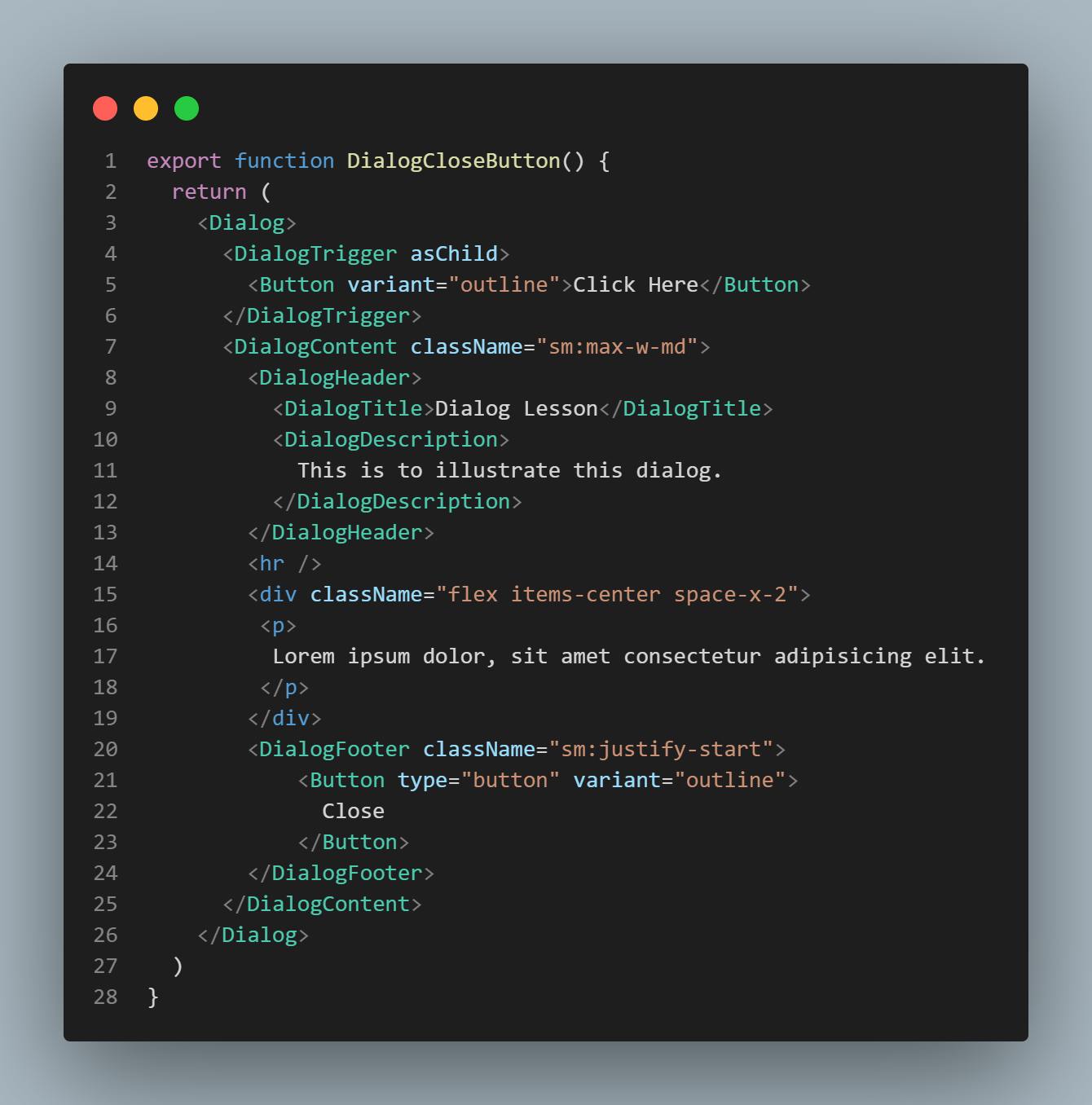
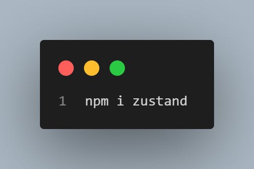
This is the initial code for our component. Now we are going to customize the trigger and make the dialog component global in our application. We need to install zustand for state management.
then create a hooks folder, create a file, useDialog.ts, and write the following code:
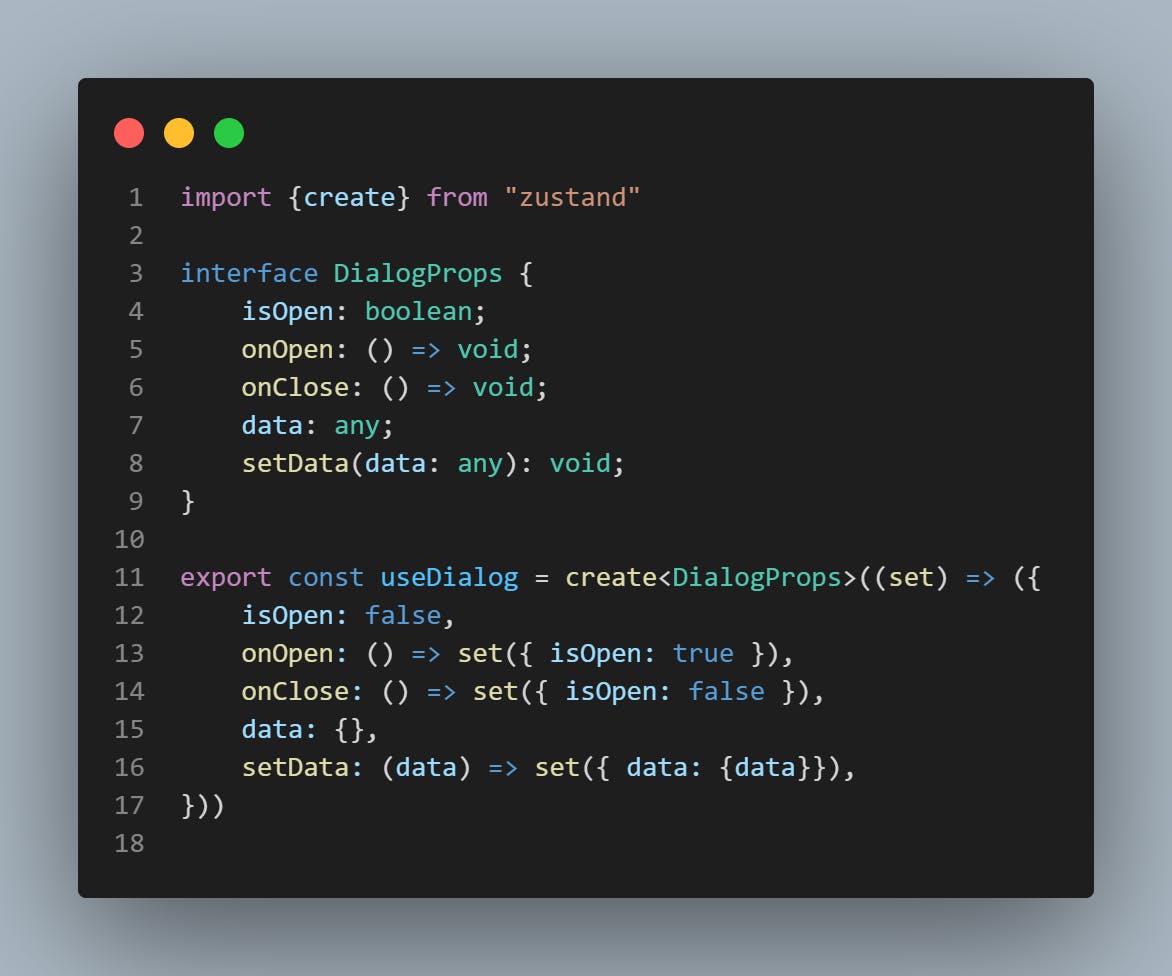
This will control the state of the dialog component, and you will see how we are going to add the hook to the component.
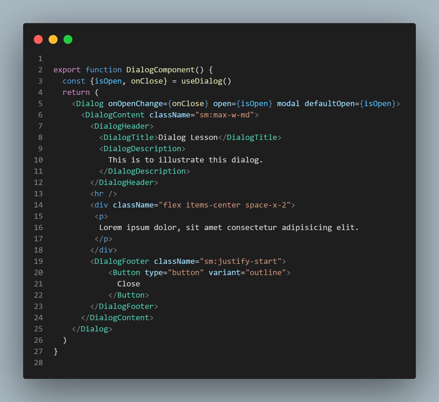
You can see I have removed the default DialogTrigger from the shadcn UI, the hook is what triggers the Dialog component. This is very helpful, especially when the modal is needed on various pages of the application. You also need to create a file component named ModalProvider.tsx so that you can add all your dialog components there for clean and scalable code.
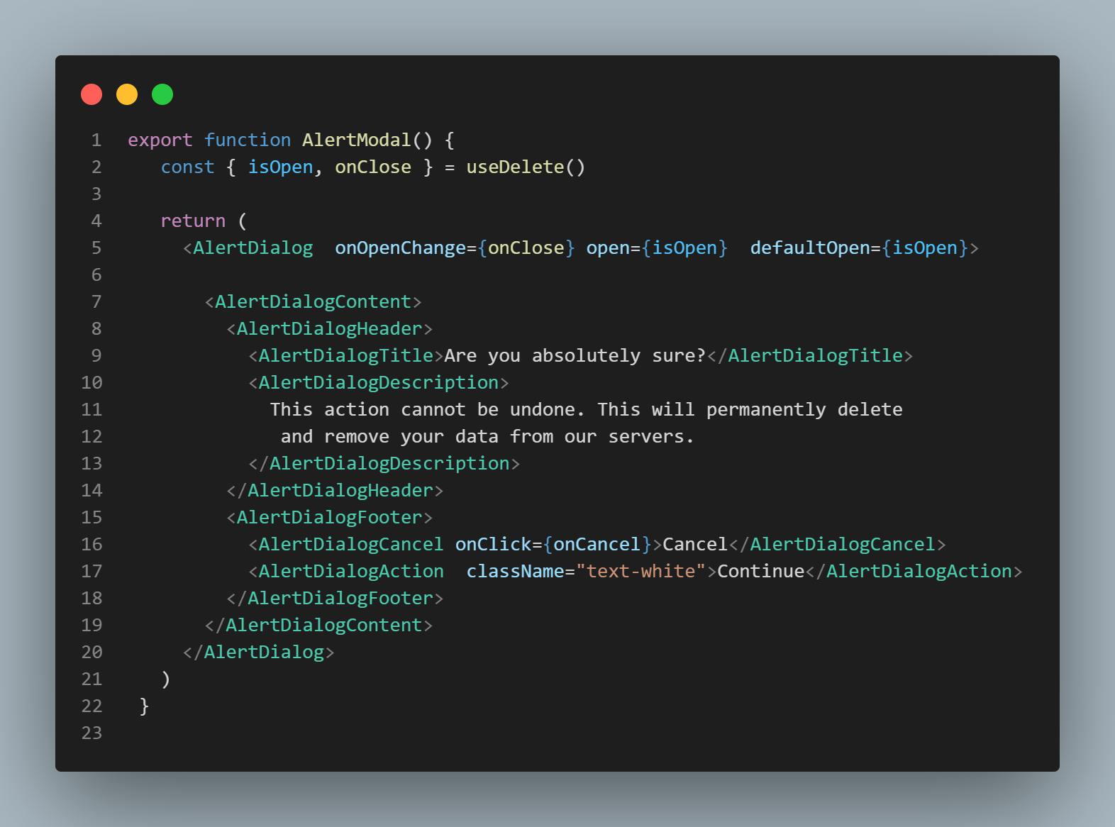
You can also this method in another shadcn/ui component called Alert Dialog
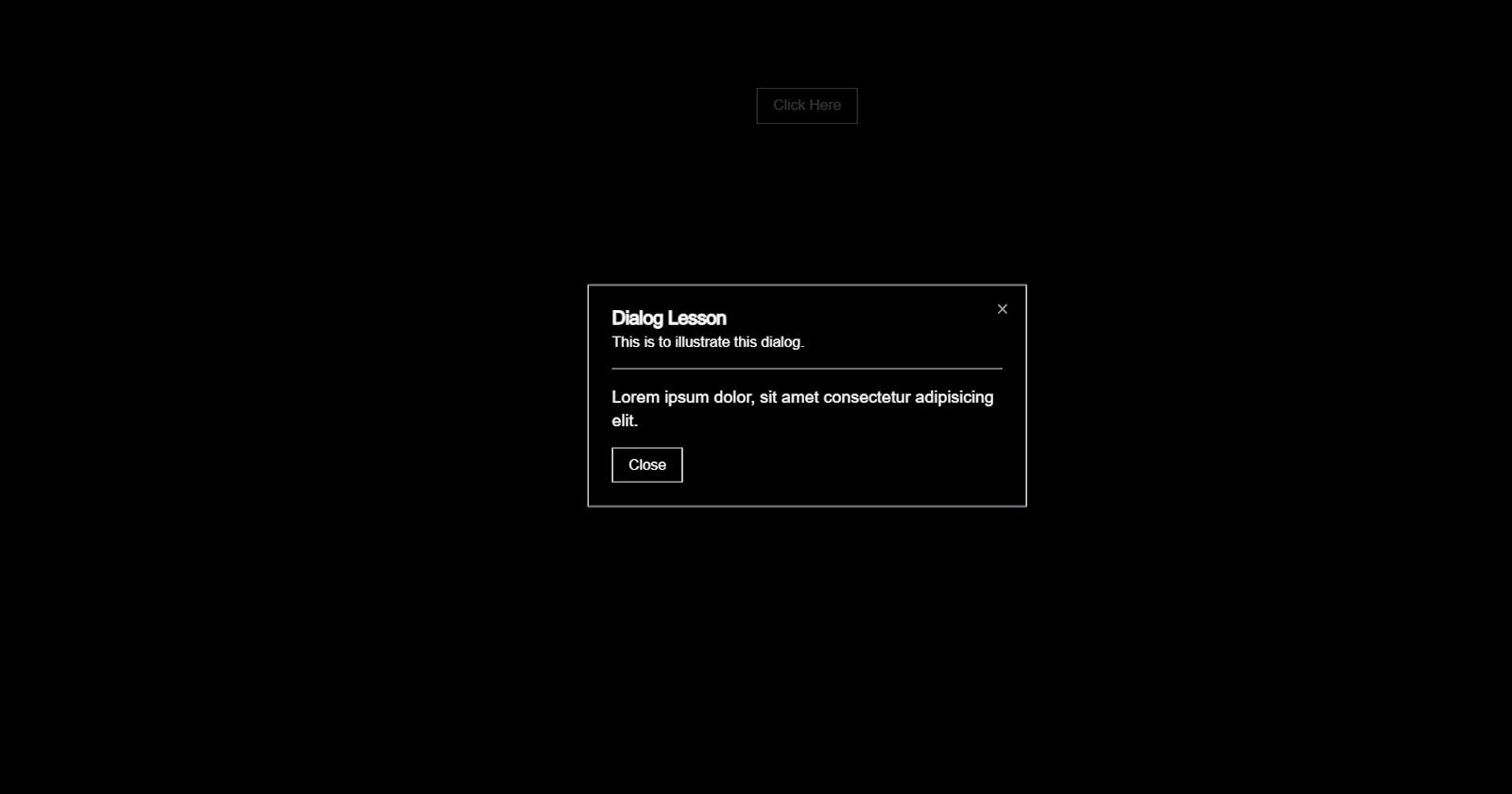
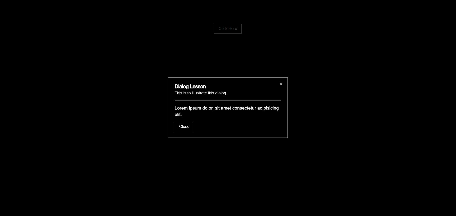
Result of the code:

I hope this helps you to navigate your way around dialog components in shadcn/ui. I will post more about using shadcn/ui in front-end development. I’ll be waiting for recommendations and feedback. Thank you, and I hope you enjoy it.
Peace.
Ezigbo ❤